Colour is the single most powerful — and most feared — design decision in a home. Get it right and every other element clicks into place. Get it wrong and no amount of expensive furniture will save you. The good news: colour selection follows rules, and once you understand them, confidence replaces paralysis.
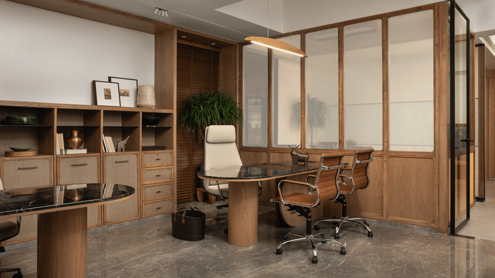
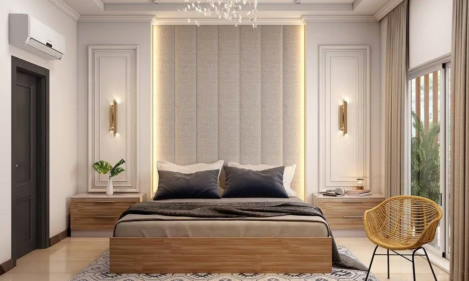
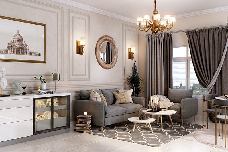
Sample warm-neutral palette — a signature Decorette approach for Delhi NCR living rooms
Colour Theory Fundamentals
Before selecting paint swatches, understanding the colour wheel gives you a framework to evaluate any combination. The three foundational relationships that produce beautiful interiors are:
Colour Psychology — How Colours Make You Feel
Every colour triggers physiological and psychological responses. Understanding these helps you align the colour of a room with its intended purpose:
- Blue: Lowers heart rate and blood pressure. Promotes calm and focus. Ideal for bedrooms, bathrooms, home offices. Avoid in dining rooms where it suppresses appetite.
- Green: The most restful colour for the human eye. Connects to nature, reduces anxiety. Universally applicable — living rooms, bedrooms, kitchens.
- Yellow: Stimulates serotonin. Energising and optimistic. Best in kitchens, breakfast rooms, children's areas. Use muted mustard tones rather than bright primary yellow on large surfaces.
- Red / Terracotta: Increases heart rate, stimulates appetite and conversation. Perfect for dining rooms and entertainment spaces. Overwhelming in bedrooms.
- White / Off-white: Reflects light maximally, creates perceived spaciousness. Essential in small Delhi NCR apartments. Warm whites (cream, ivory) feel more inviting than cool whites (stark white, blue-white).
- Black / Charcoal: Dramatic, sophisticated, grounding. Use as an accent — feature walls, door frames, cabinet fronts — rather than dominant surfaces.
- Gold / Bronze: Warm, luxurious. Pairs beautifully with deep greens, navy and charcoal. Works as metallics in fixtures, hardware and light fittings.
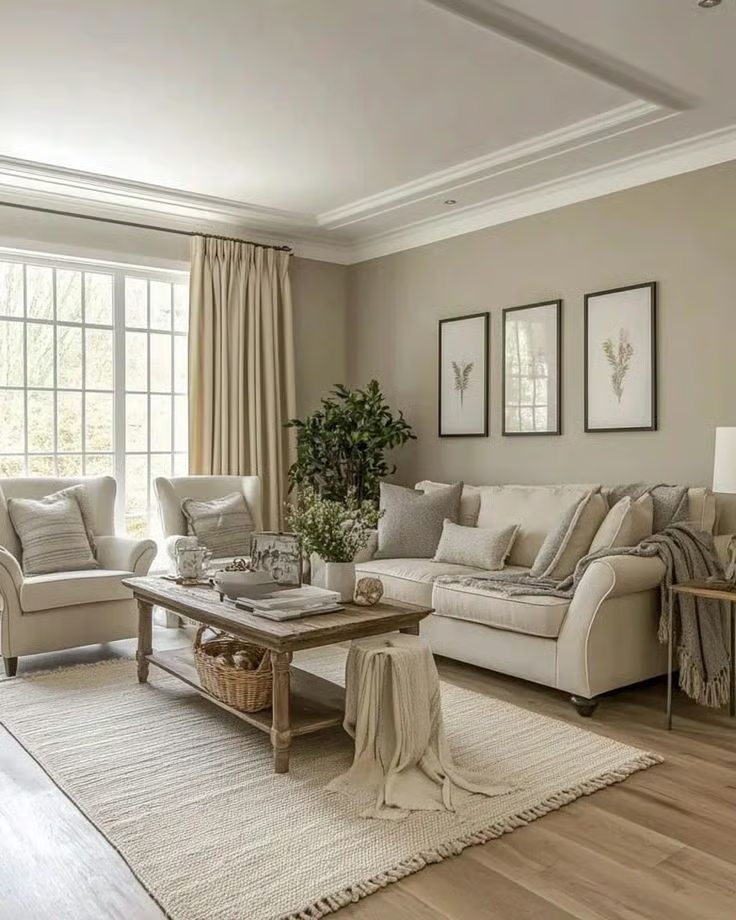
Warm neutral palette in action — cream sofas, earthy botanicals and rattan accents in a 3BHK Gurugram home by Decorette
Undertones — The Most Misunderstood Concept
This is where most DIY colour schemes fail. Every paint colour — even white and grey — has an undertone: a subtle secondary colour visible when placed next to other colours or in specific lighting. Clashing undertones create a room that feels "off" without any obvious reason.
- Warm undertones (yellow, red, orange) make spaces feel cosy and inviting. They pair well with wood tones, terracotta, brass and warm-white lighting.
- Cool undertones (blue, green, purple) feel crisp and airy. They work with chrome, glass, marble and cool-white daylight LEDs.
- Neutral undertones (greige, warm grey) are the Swiss Army knife of interior design — they transition between warm and cool spaces gracefully.
Always test paint on a 30×30cm card and observe it at different times of day (morning, afternoon, evening with artificial light). Delhi NCR's warm afternoon sun and cool LED evenings can make the same colour look completely different. Live with the test card for 48 hours before deciding.
The 60–30–10 Rule
The most reliable formula for a balanced colour scheme. The proportions mimic how the eye reads a room and provide natural hierarchy:
- 60% — Dominant colour: Walls, large floor area. Should be the most neutral in the palette — the backdrop that lets everything else shine.
- 30% — Secondary colour: Upholstery, curtains, large rugs, secondary furniture. Adds personality without overwhelming.
- 10% — Accent colour: Cushions, artwork, decorative objects, plant pots, light fixtures. This is where you can be bold. Change the accents and the whole room shifts mood.
Room-by-Room Palette Guide
Different rooms have different requirements. Here are Decorette's recommendations for each key space in a Delhi NCR home:
Lighting and Colour — An Inseparable Pair
The same paint colour can look dramatically different under different light sources. This is arguably the most overlooked variable in DIY colour selection:
- North-facing rooms (common in older Delhi NCR apartments) receive cool, blue-toned light all day. Compensate with warm-undertone paints (creams, warm greys) to avoid a cold, flat appearance.
- South-facing rooms receive intense, warm light. Cool colours balance beautifully here — sage green, dusty blue, lavender.
- Incandescent / warm LED (2700–3000K): Amplifies warm colours (red, orange, yellow, gold). Makes cool blues and greens appear more muted.
- Cool white / daylight LED (5000–6500K): Makes blues and greens pop. Strips warmth from terracottas and can make skin tones look unpleasant.
In open-plan Delhi NCR homes, carry one colour across connected spaces in varying tones. For example: warm taupe in the entryway, one shade darker in the living room, two shades lighter in the kitchen. This creates visual continuity and makes the home feel larger than it is.
Common Mistakes to Avoid
- Choosing colour from a tiny paint chip under store fluorescent lighting — always test at home.
- Matching every element exactly — slight tonal variation creates depth; perfect matches look flat.
- Following trends blindly — some palettes (millennial pink, ultra-violet) have a 2–3 year shelf life. Invest in classic palettes and refresh with accessories.
- Forgetting the ceiling — the fifth wall. A white ceiling on a coloured room reads as unfinished. Use the wall colour at 50% saturation on the ceiling for a polished, considered look.
- Ignoring skirting boards and door frames — painting them in a contrasting or complementary colour rather than default white adds significant architectural refinement.